I DESIGN A LOT OF THINGS.
I've never been able to stick to one medium because mostly, I like to think of design as story-telling, and story telling can happen in print, on a screen, a mobile device, through and image, and in any number of other ways.
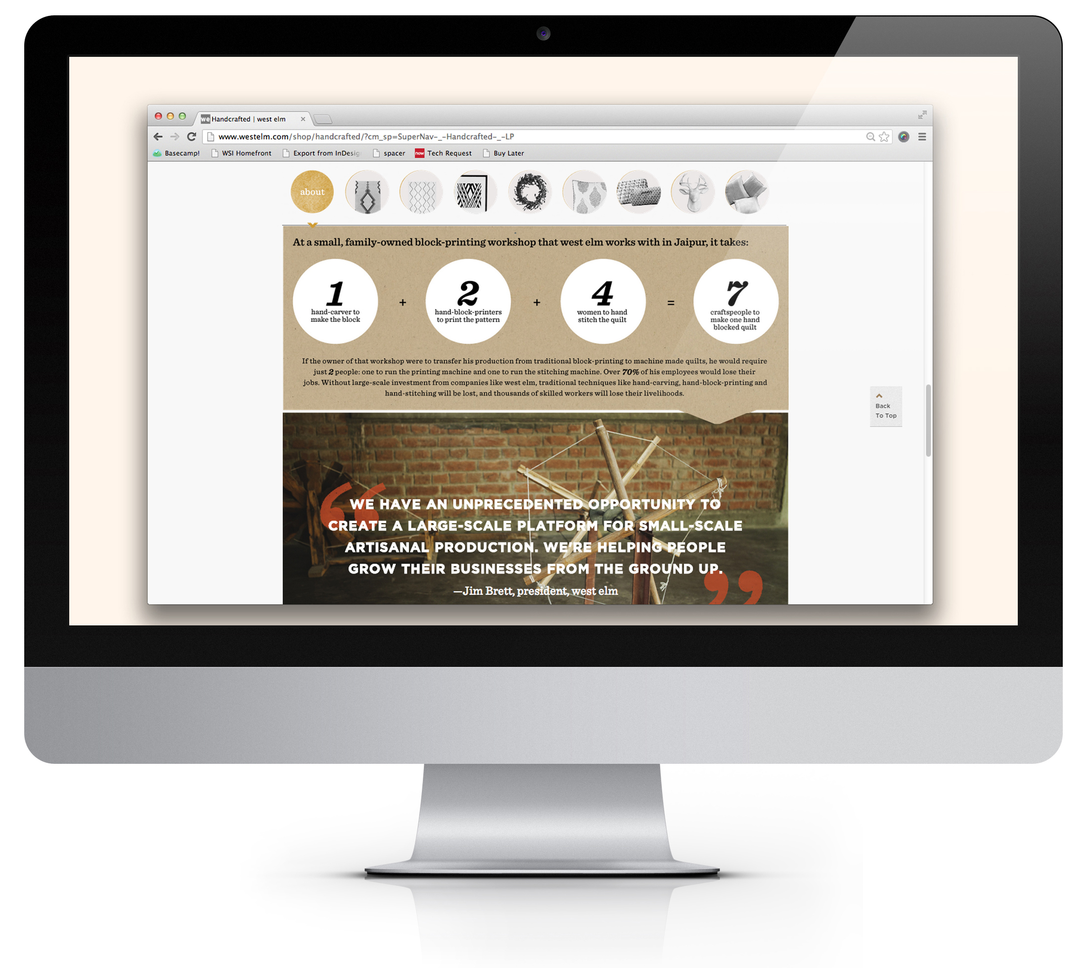
The launch of West Elm Handcrafted was West Elm's first attempt at a true 'advertorial' user experience, I was lucky enough to have been brought on for Art Direction and Design due to my editorial background. The Goal was to immerse the user in the story of the makers, allow for a non-intrusive purchase avenue, and also to engage them with exciting visual content, like on location photos & video. Click through for the entire Handcrafted micro-site


When NRDC approached me to recreate their magazine onEarth in the digital space, I was more than excited. Not only did I have the chance to make a playground for great content I believed in, but it was also one of those projects that had a lot of problems but not yet many solutions. Ultimately I landed on a duel space that would house the digital magazine and its archives as well as daily content


BOOK DESIGN & PRODUCTION
Jesus in the Life of Joseph was the seminal publication for Emergence Church. The church, based in the North East serves nearly 3,000 congregants and wanted to create a resource that would coincide with a 10-week lesson plan. The concept, for the work to be equal parts study guide, interactive lesson plan and a real-time road map through the spoken content was not only designed but also produced by my team, in-house. This presented a number of challenges, which are not limited to: managing a 3 person editorial and fact checking team, a 4 person art team as well as a 15 person production crew. The results were stunning.


HOMETOWN PRINTS & POSTCARDS
Jersey gets a pretty bad rep. around the world. A lot of it is deserved. But there is a whole lot that goes on inside the borders of New Jersey that are both beautiful and culturally relevant. New Jersey Counties is a personal project that creates a postcard sized illustration for each of the 21 New Jersey counties based on their historical relevance or their environmental layout.


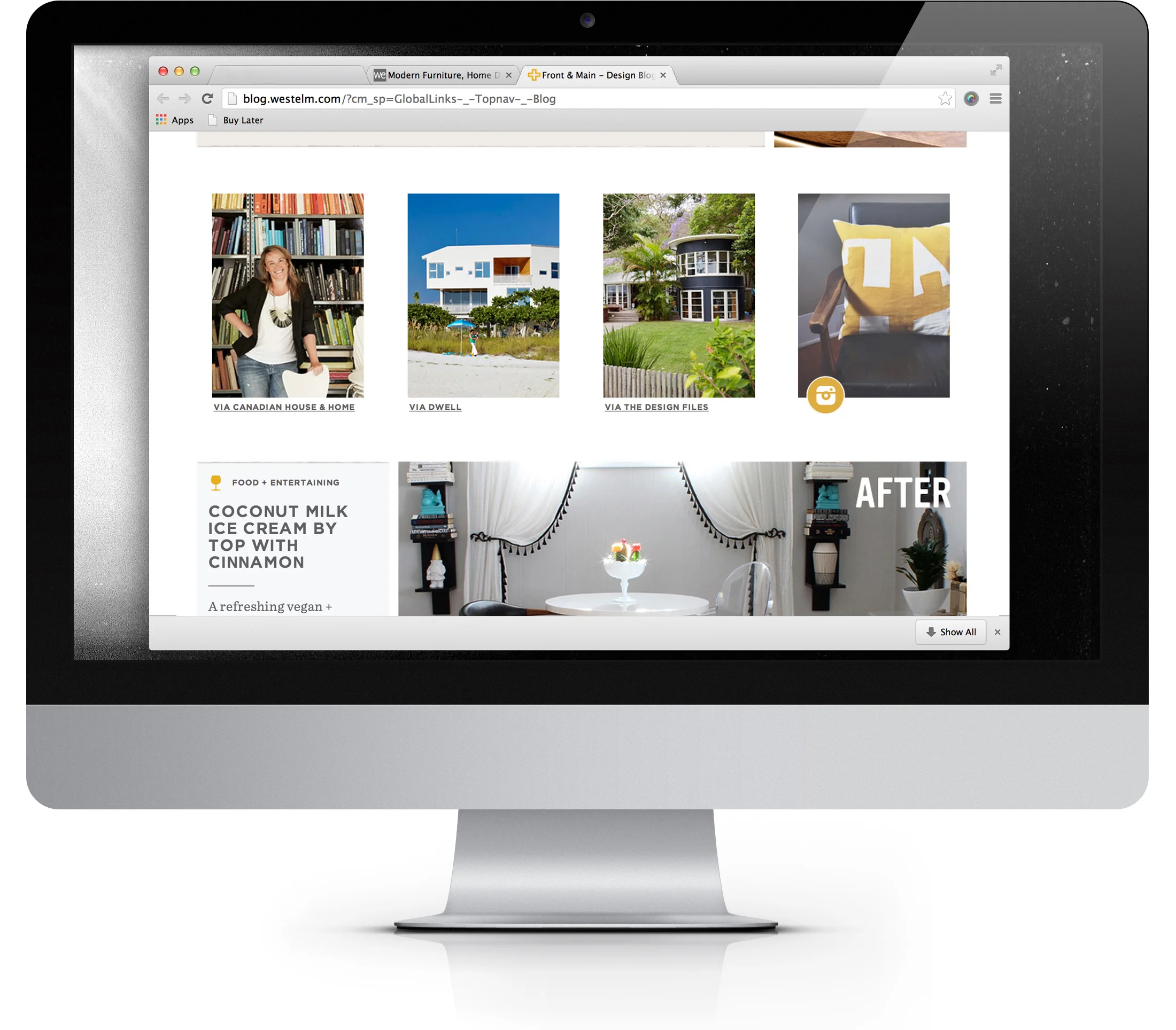
Front + Main solved a long running problem at West Elm: 'Where do we put all this amazing content, without it being overwhelming?' Art Directing this project was a delight as we got to discuss and ultimately solve questions like: 'What content should be paired together?' And, 'How can color serve to create our grid?' Working with designer Dominic Fortunato on this project made directing the easiest part of the process.
52 WEEKS
Personal deadlines forced me to learn how to think creatively in a limited time. in 2012 I set a goal to create one illustration per week for a year. It was challenging and rewarding, and really helped me walk in a direction that gave me confidence in my art and in my limitations.


The Rob Yaskovic branding and website project was a great example of trying to stay out of the way of good content. I wanted to create a simple solution that would allow the user to experience the photos as if they were in an album: set apart cleanly with little to no distractions.
