1937 International
Brand Identity · Custom Typography · Experiential Design · Print · Merch
Industrial hemp has a credibility problem. Not a product problem.
1937 International is building the infrastructure layer the industrial hemp industry has been missing: a global supply chain connector linking farmers, processors, and buyers across long fiber, short fiber, hurd, and textiles. The product is real. The supply is real. But in an industry still fighting for legitimacy, showing up without a brand is showing up without credibility.
The brief was to build a brand from scratch — identity, typography, color system, and a full experiential presence for their debut at the Industrial Hemp International conference in Denver — that could make a startup feel like a permanent institution.
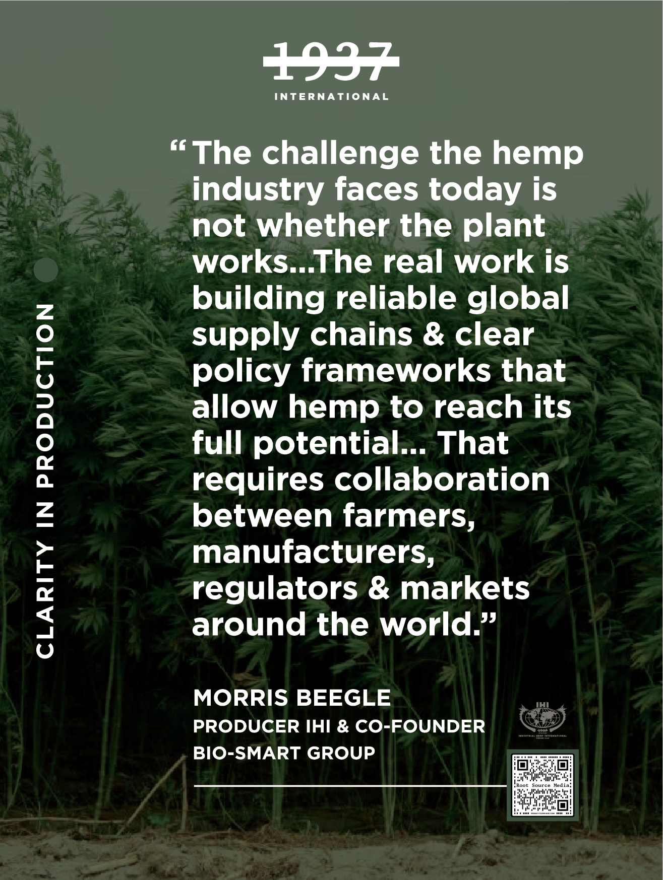
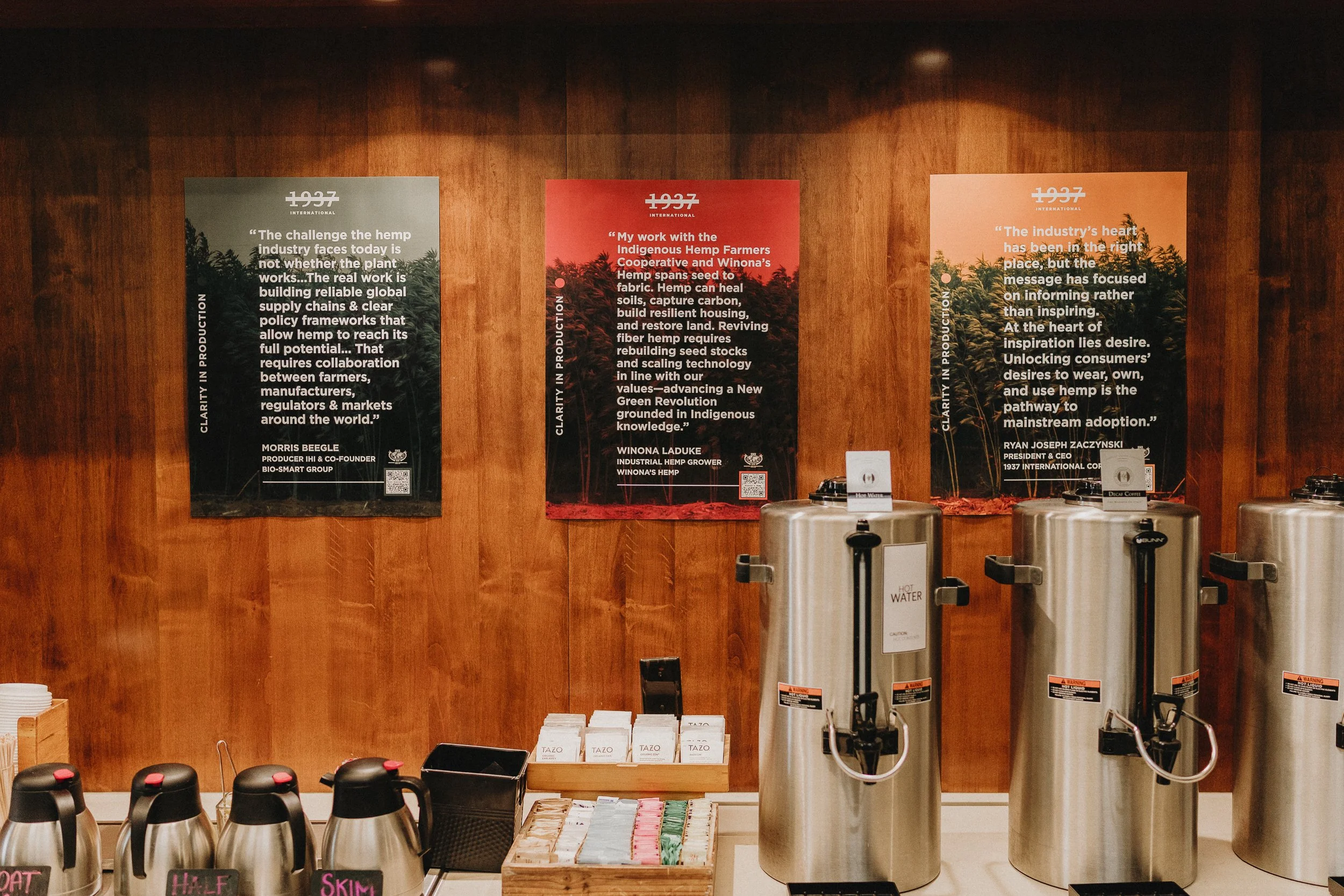
The industry's heart has been in the right place, but the message has focused on informing rather than inspiring.
Ryan Joseph Zaczynski, President & CEO, 1937 International
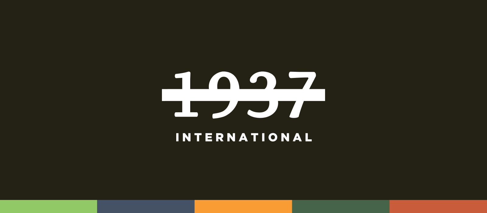
The name is the brief. The history is the palette.
Everything in this brand starts with 1937 — the year the Marihuana Tax Act effectively banned hemp in the United States, ending decades of industrial use and setting the supply chain back nearly a century. The struck-through numeral mark isn't decorative. It's a position: crossing out 1937 means crossing out everything that year took from the industry.
The color palette is pulled directly from the original 1937 Marihuana Tax Act revenue stamps — amber, slate blue, forest green, terracotta. Colors with genuine historical provenance, repurposed as the visual language of an industry reclaiming its future. Custom typography rounds out a system that feels institutional and urgent at the same time.
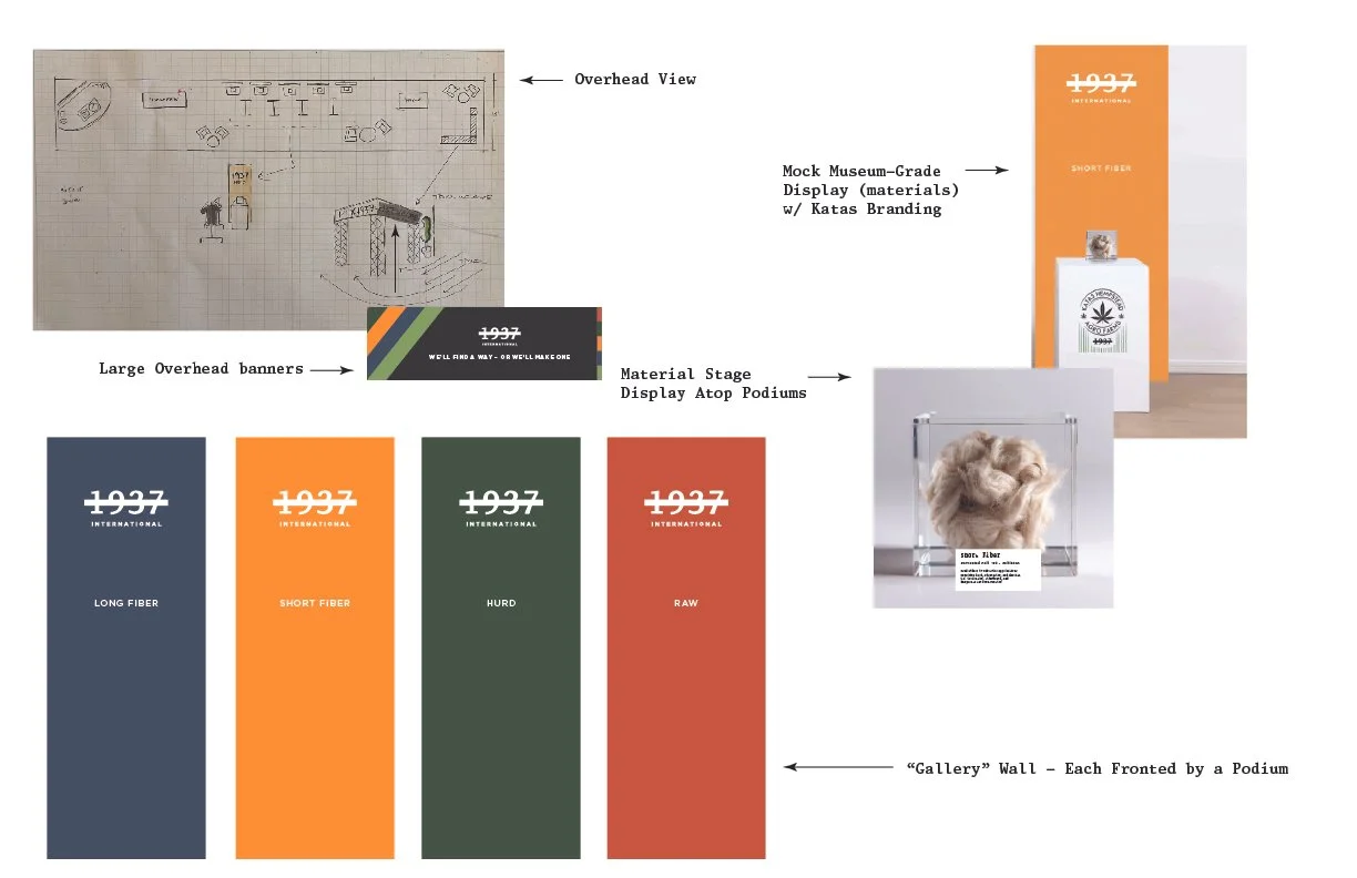
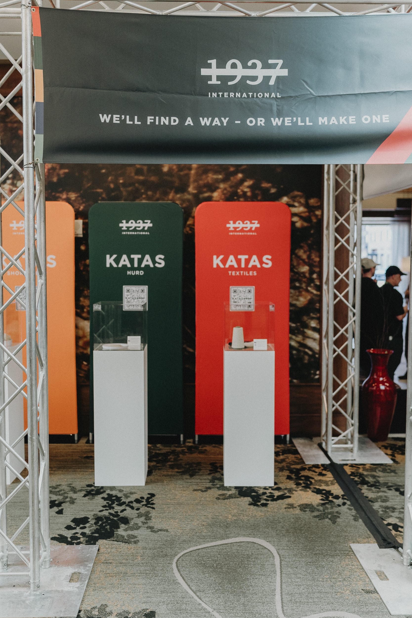
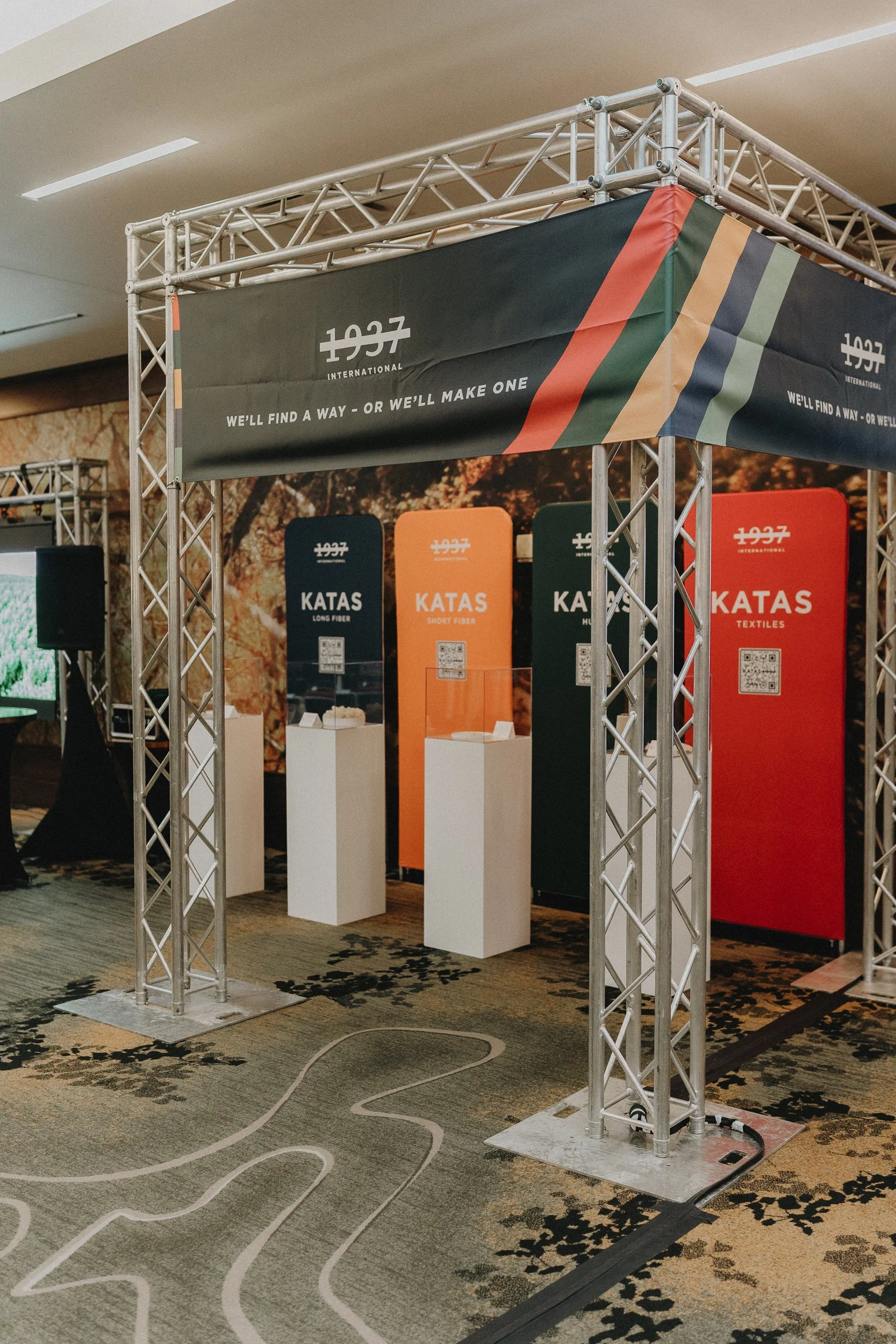
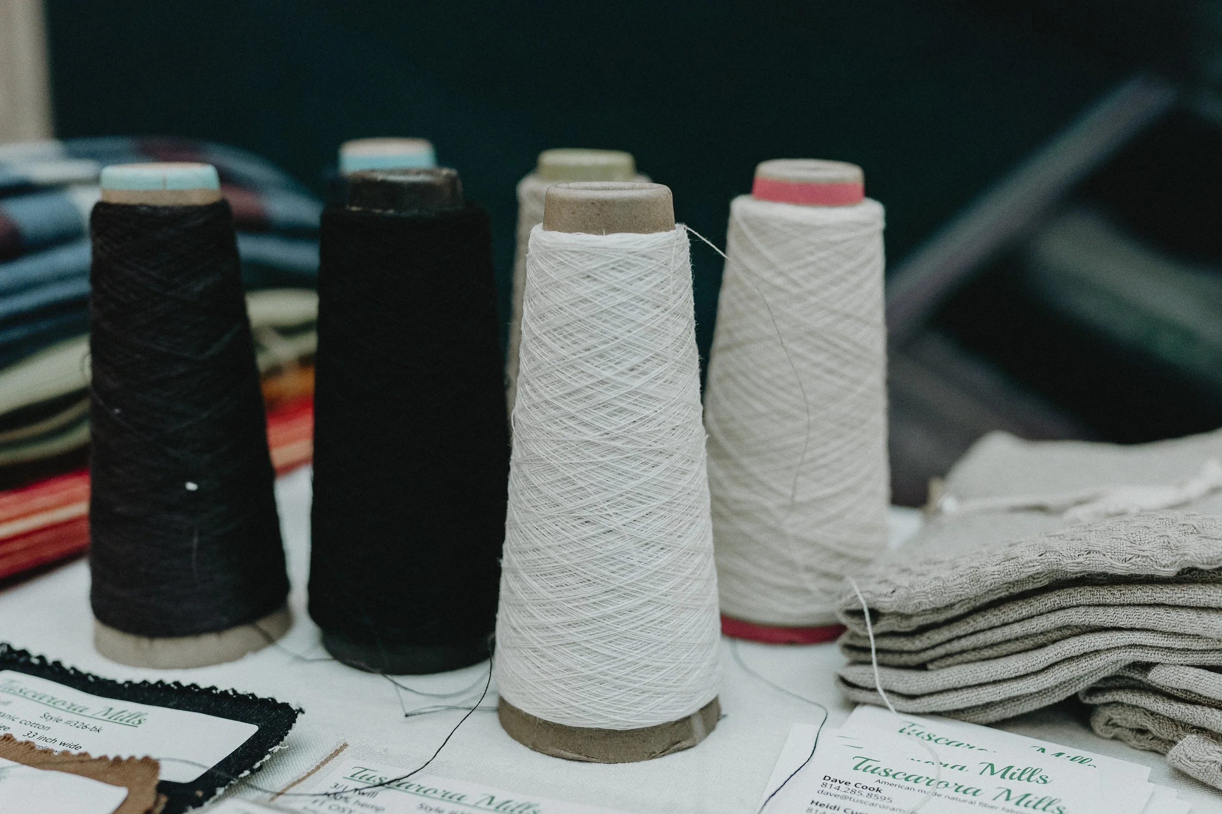
One brand. Four material categories. A color for each.
The Katas product line — 1937 International's material brand — needed a system that could differentiate four distinct hemp materials at a glance while remaining unmistakably unified. Each category received its own color pulled from the brand palette: slate for Long Fiber, amber for Short Fiber, forest green for Hurd, terracotta for Textiles.
The vertical banners, truss overhead, speaker posters, and museum-style material cards all operate from the same visual brief — the brand reads as a coherent system whether you're looking at a 7-foot banner or a 3x5 display card inside an acrylic case.


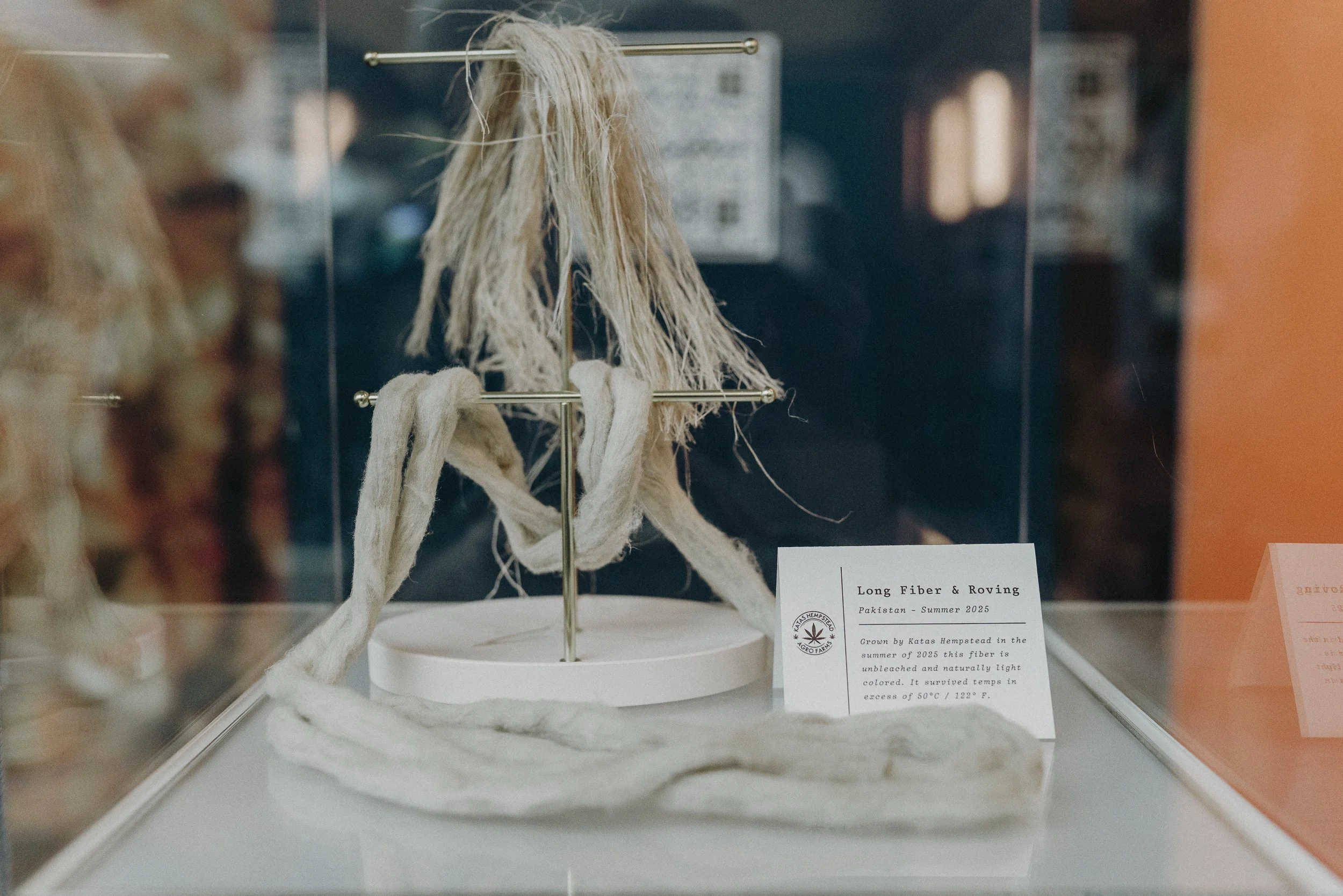
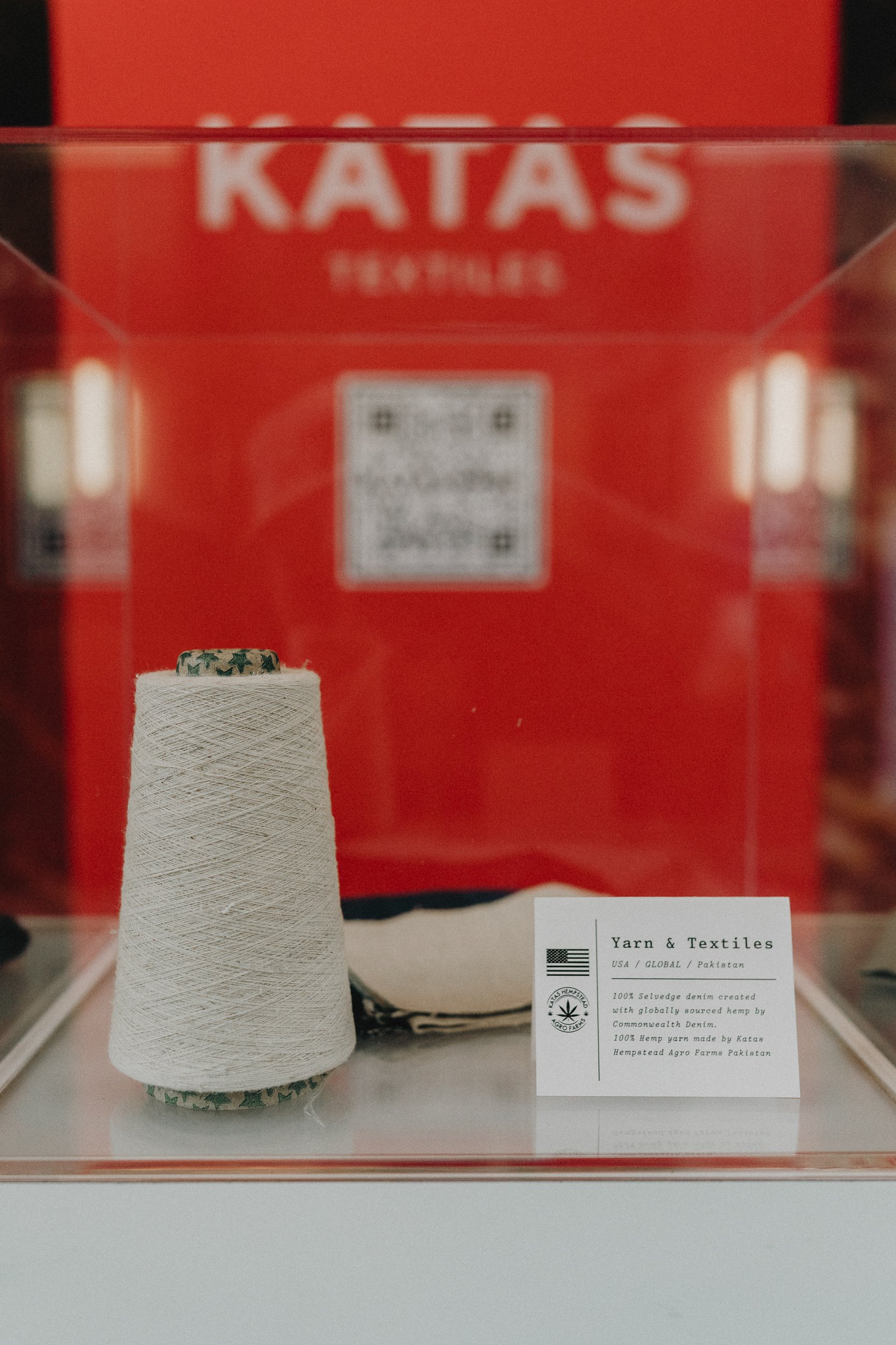
A museum, not a booth.
The brief for the IHI conference activation was straightforward: don't look like a trade show booth. Industrial hemp conferences are full of folding tables and banner stands. 1937 International needed to arrive as something else entirely.
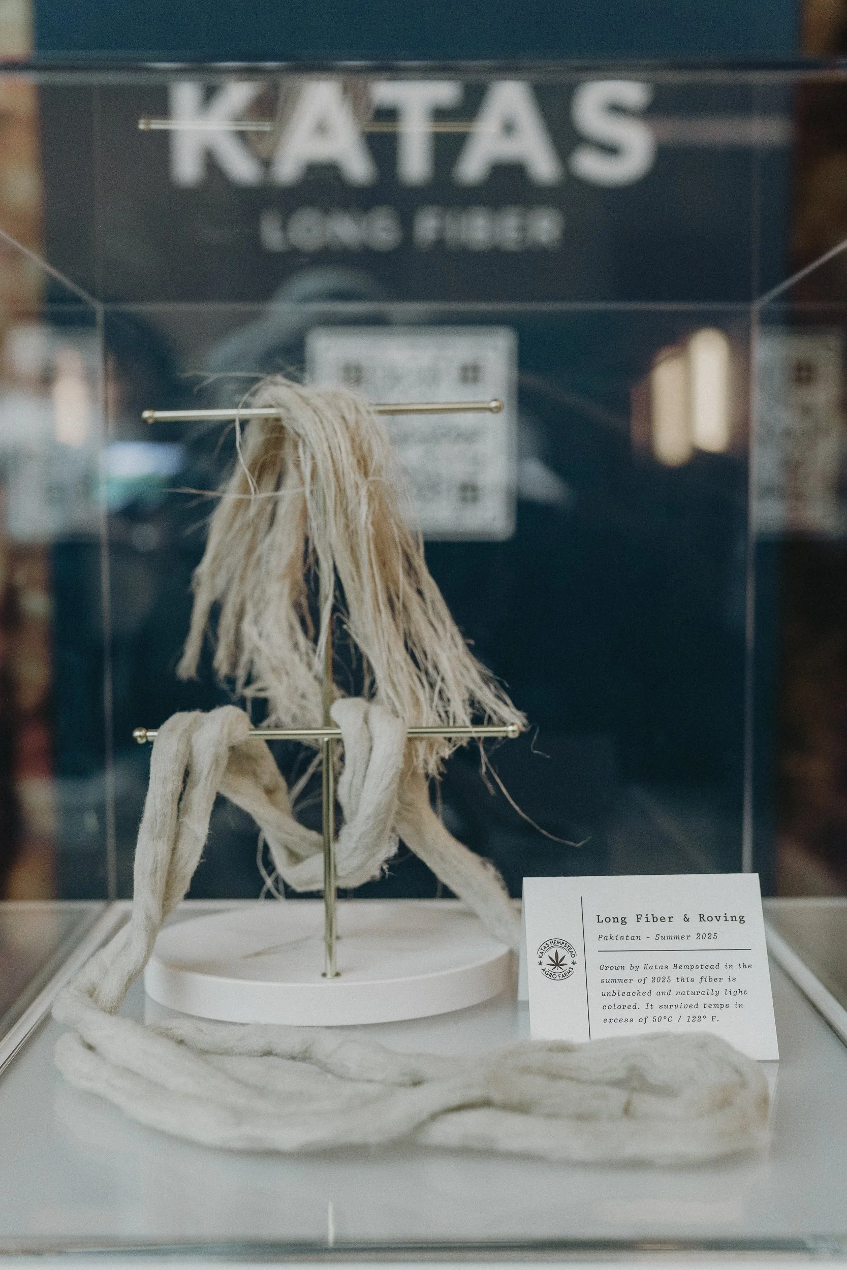
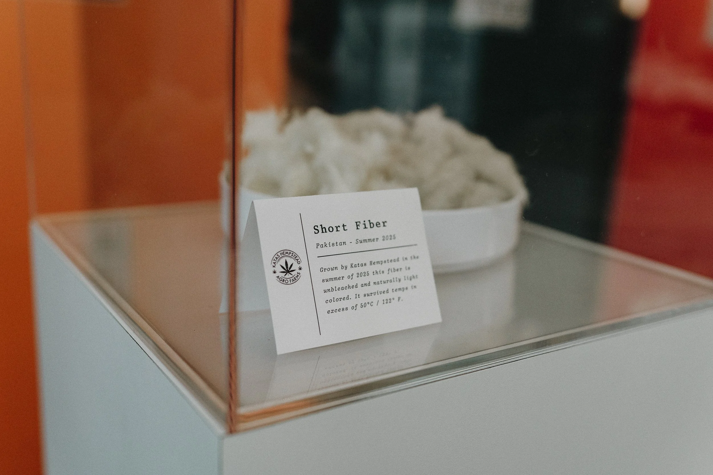
The installation was designed as a gallery — a truss structure overhead carrying the brand's tagline ("We'll Find a Way — Or We'll Make One"), four color-coded vertical banners forming a gallery wall, and white museum-style podiums each displaying actual hemp material samples in acrylic cases with branded provenance cards. The effect was closer to a natural history exhibit than a vendor table. Every material was treated as a specimen worth studying.

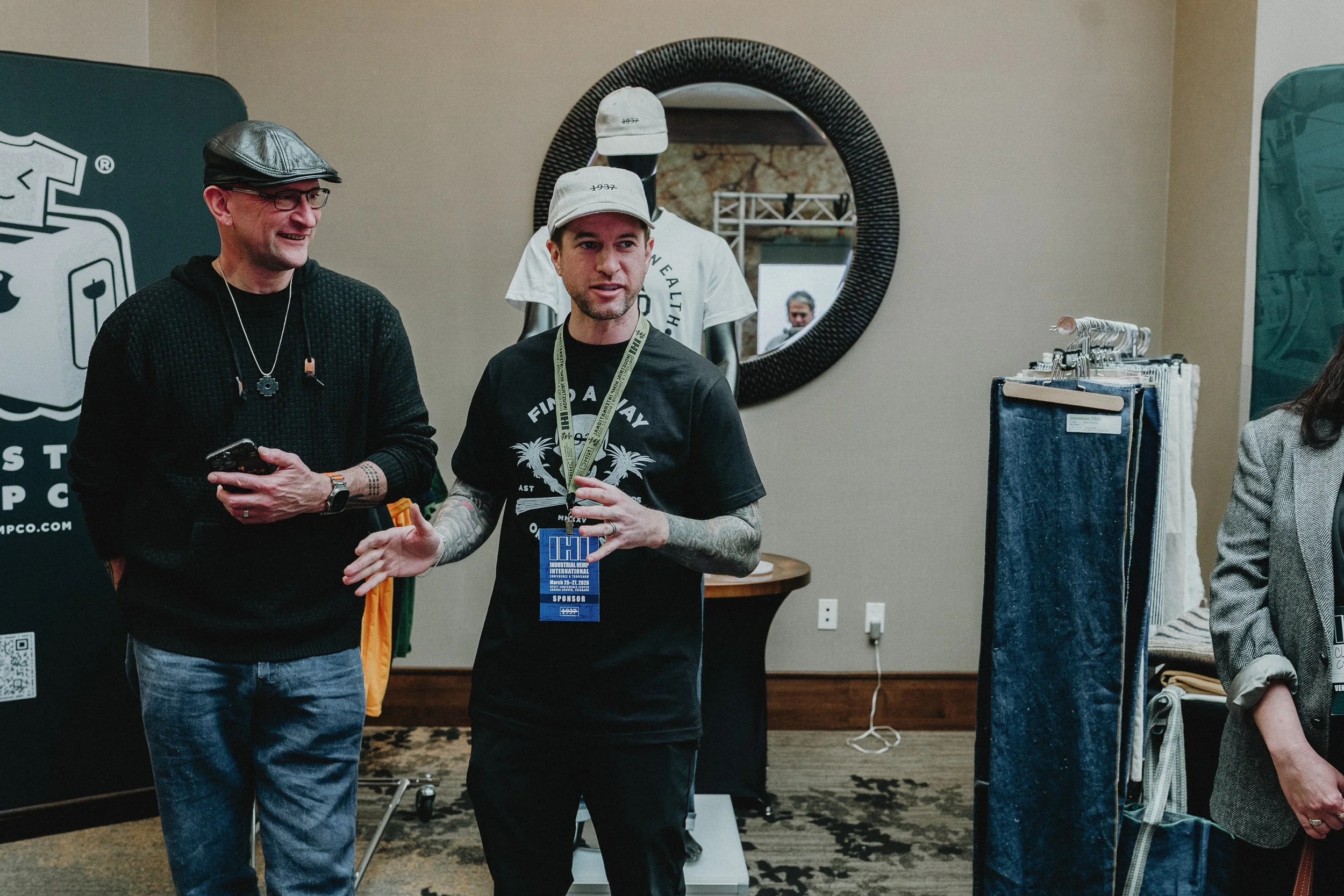
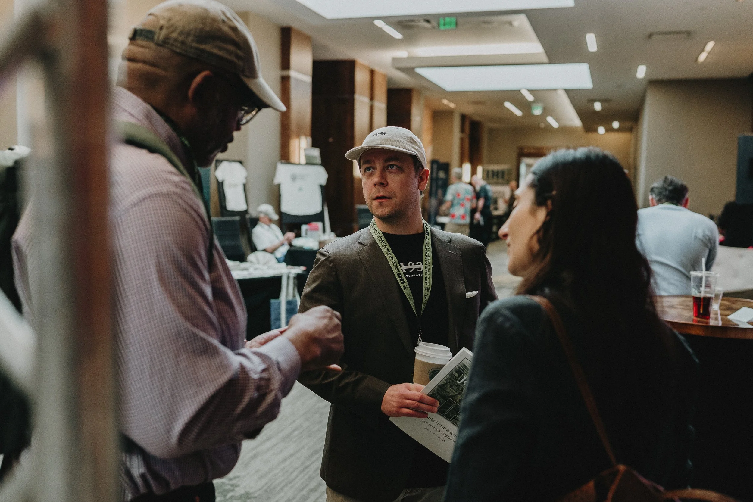
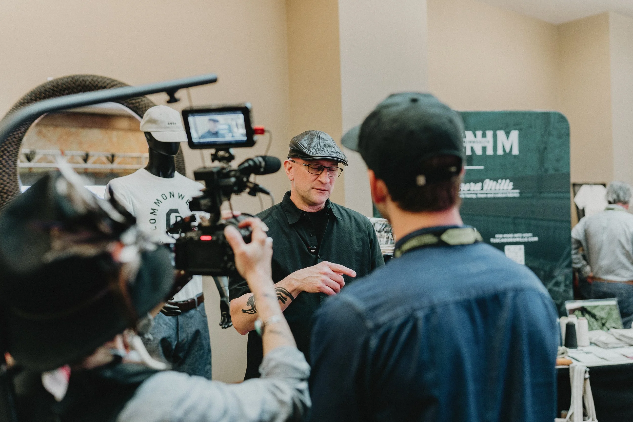
The brand drew a crowd and a camera crew.
At a conference where most booths blend together, the 1937 International installation stopped people. Ryan Zaczynski fielded conversations and a video interview in front of the Katas banner wall — the brand doing exactly what it was built to do: create the visual authority that makes a two-year-old company feel like it's been here the whole time.
A startup that arrived looking like an institution.
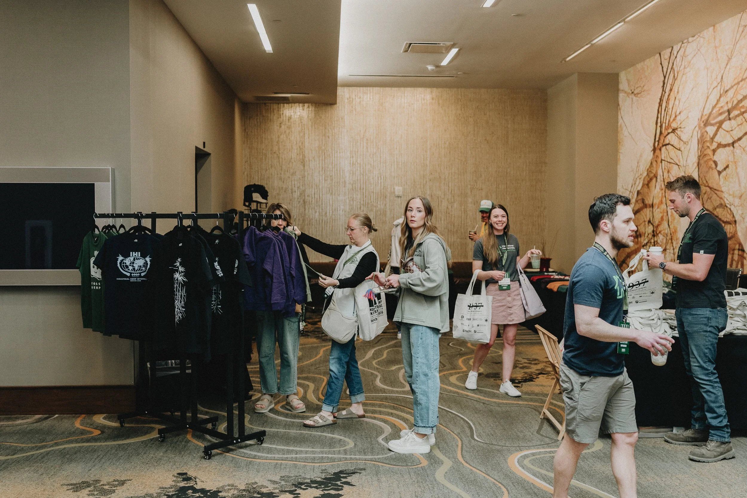
1937 International debuted at IHI Denver with a brand system, a physical installation, speaker posters, print collateral, and conference merch — all built from a common brief and deployed simultaneously. The brand is now live at 1937international.com with a full site in development.
For a company whose entire value proposition is credibility — convincing buyers and sellers to trust a new supply chain infrastructure — the brand does essential work before anyone says a word.
In an emerging industry, the brand is the proof of concept.
Industrial hemp doesn't have a product problem. The fiber is real, the applications are proven, the supply exists. What it has is a perception problem — and perception is a design problem. The color palette pulled from 1937 tax stamps, the struck-through numeral, the museum installation: none of that is decoration. All of it is argument.
Building a brand for a company operating in a contested space means understanding that every visual decision is also a rhetorical one. The brief wasn't "make it look good." It was "make people believe."